Problem
Brand stores on Amazon had no real WYSIWYG editor, so every page risked becoming a jumble of unrelated components. My mission was a scalable tool that lets teams build good-looking pages without code or design skills, while external partners keep their own typography, colors and branding.
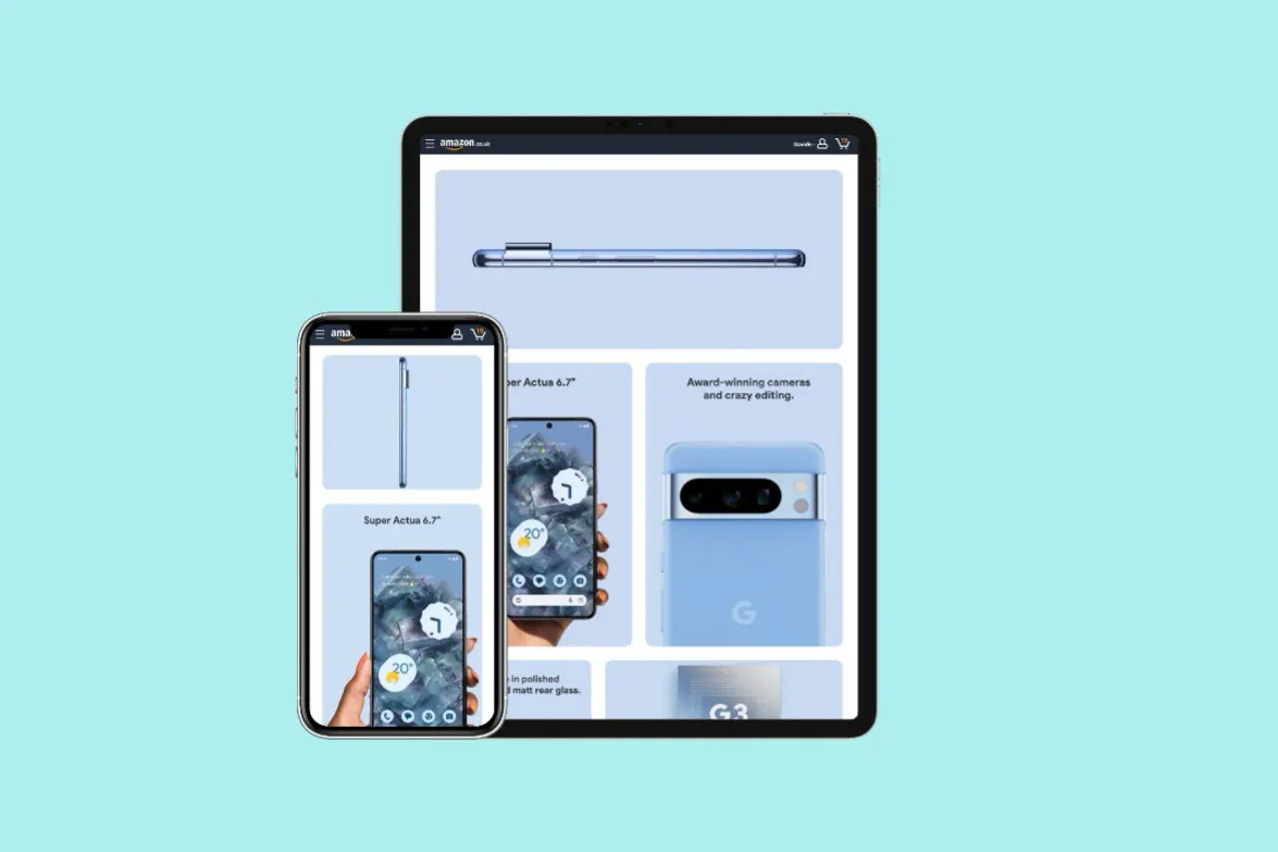
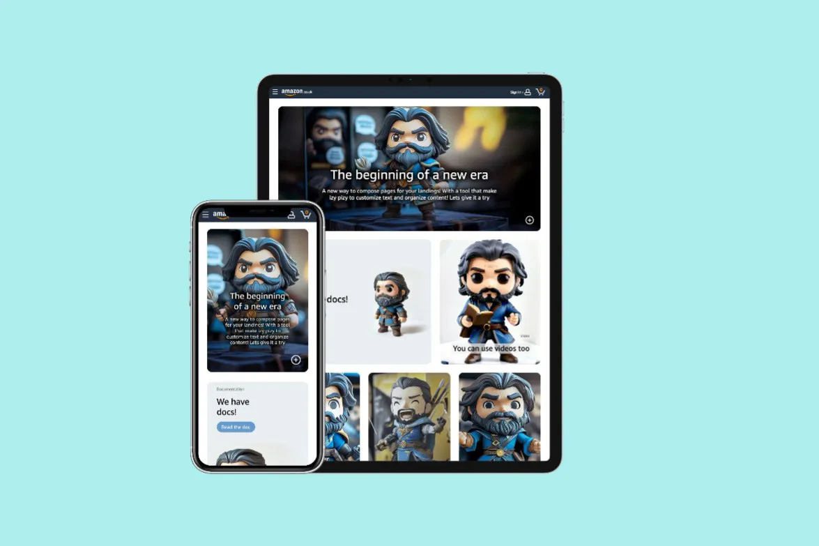
Configurable without code
The component is set up through a React form: no coding skills needed. With it, at least the part of the page that describes the product finally reads as one harmonious whole.
Key decision: no breakpoints
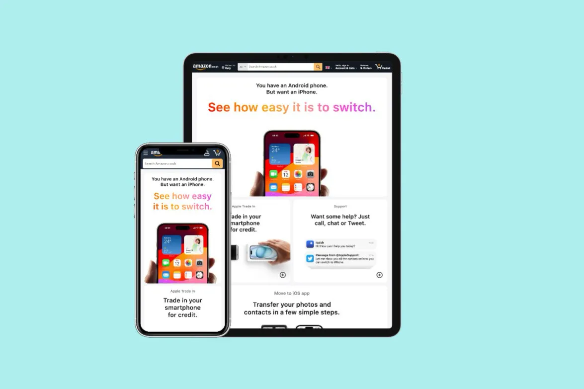
CSS Grid, Flexbox and a lot of clamp() make the layout fully responsive without a single breakpoint: the bento adapts to any screen size, and the text adapts to the space its parent has. I had to defend this choice: a layout that only exists on the web is hard to design in static tools like Figma.
All colors and dimensions are customizable, so the tiles adapt to whatever imagery advertisers bring.
Accessible by default
Focus trapping, correct semantics and an enforced, meaningful content structure: accessibility isn’t left to whoever fills in the form.
Outcome
Product benefits shown as a bento box of images, videos and text: key information at a glance, with the details revealed on interaction. Used in at least two campaigns before I left Amazon.